In this article I'll tell you how to create a webpage layout. Creatin a webpage layout can be tricky. It's a balance between creating something that looks great but still conveys the important points.
There are lots of ways to layout your website depending on it's purpose. If your website is orientated toward selling products your flow should lead people toward buying your product, but if your website is about conveying information an entirely different page layout may be ideal.
For this reason the first part to creating the perfect page layout is deciding what the primary goal of your website. Determinging the goal of your website will help you focus on what's most important.
Choosing font color
Once you've determined the goal of your site there are certain things you can do to ensure your webpages look great. For example: you should always use a contrast of colors between the text on the background of your website. That way the text is readable. If you put something like yellow text on a white background your visitors will be squinting trying to make out the words.
If you really want something to pop consider using good old black text on a white background. It's high contrast, easy to read, and jumps out of the page. If you're looking to create a softer look perhaps try choosing a dark gray for your text color on a white background. The text will still be readable but it won't pop off the page quite as much. That may be beneficial if you're trying to communicate some points subtly.
Choosing a font
Fonts can be tricky. It seems like most of the people I've coached on creating a website want to get too creative and select a font that's difficult to read. You should resist the temptation. An overly creative font, like a script may seem cool but should be used sparingly, only as an accent. That way the majority of the text on your pages will remain easily readable but you won't be completely exempt from that creative flare.
Using guidelines
Aligning page elements with each other will provide a symetry to your pages. Use the guidelines and arrow keys to assit in creating that pixel perfect look.
Using the arrow keys
Pressing the arrow keys will move any element one pixel at a time in any direction. By holding the shift key and using the arrow keys elements can be moved ten pixels at a time.
Lines
A line is a shape that connects two or more points. They can be fat, thin, straight, or squiggly. They're common in text compositions where they can draw emphasis. When working with lines pay attention to weight, color, and style.
Shapes
A shape is any two dimensional area with a recognizable boundary. Shapes can be geometric or organic. Shape make elements recognizeable.
Forms
When a shape becomes three dimensional it becomes a form. Using things like light, shadows, and perspective.
Texture
Creating balance
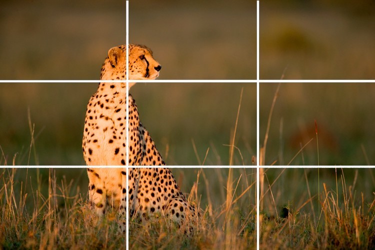
Blance is the equal distribution of visual weight. How much any one thing attracts the viewers eye. A good way to create balance is to use the fule of thirds. By creating a gride using thirds and placing elements at the cross sections you'll create a more balanced page layout.
Balance can be color, space, etc.
Utilizing whie space
White space gives a visual clue to the importance of an element on a page. It's the space between lines, and elements. It helps define what's important and gives your work room to breath.
Hierarchy
Hiarchy shows people where to begin and where to go next. Establishing hiarchy requires you to identify the most important things and make them stand out. Hiearchy in text can be established by making certain elements bold or larger than others.
Repetion
Is a reminder that every project should have a consistent look and feel. For example stick with your color palette, stick with your header. When a viewer knows what to expect they can focus on the content.
Emphasis
Use increased font weights to call attention to particularly important pieces of information like headlines and titles.
Contrast
Contrast is the difference between elements. For example black text on a white background have a high contrast. Contrast helps create emphasis, catch the user's eye, or calling attention to something important.
Proximity
This is the distance elements are between each other on the page. Proximty can be used to visually state which elements belong together, and provide people context.
Proximity is all about showing relationships between elements.
This article only covers the tip of the iceberg when it comes to design. Like all things in life becoming truly excellent at design requires more than just reading a quick article, it requires practice. So jump right in and begin creating your first layout. You can sign up to create a free website at WebStarts.com.