Creating a web design that's beautiful and functional can be tricky. In this article I'm going to share with you 5 design hacks for a better looking website.
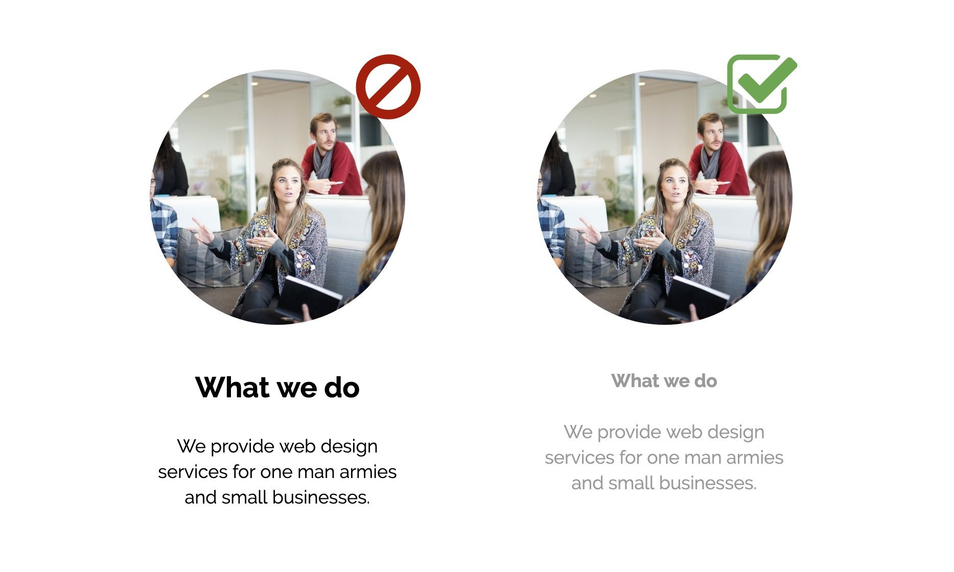
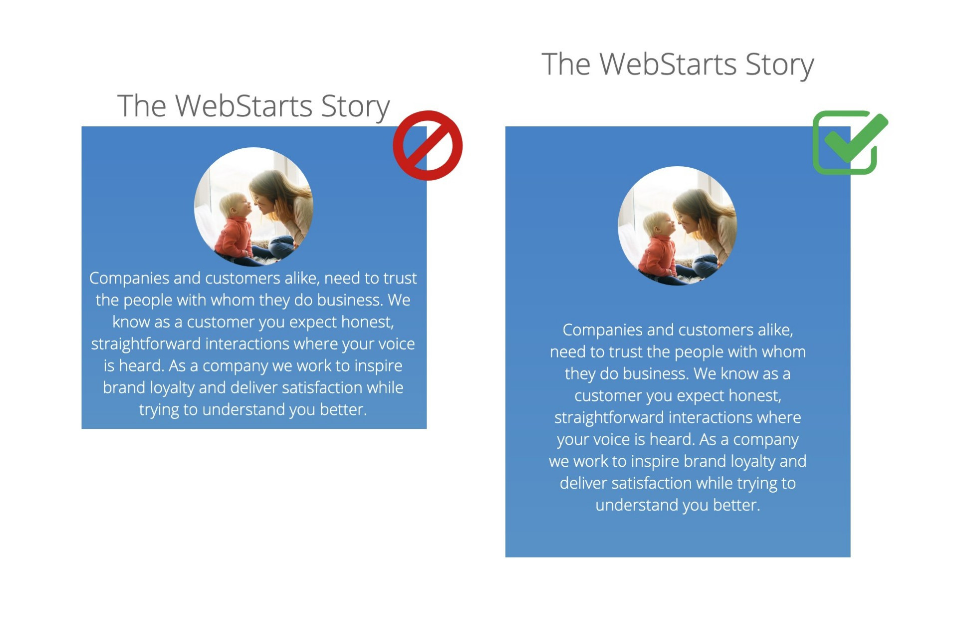
1. Use color and weight instead of size to define hierarchy.
Hierarchy is an important concept in design because it lets the viewer know what they should pay most attention to. A lot of of times on the web people make the most important thing on a web page or section the largest, but this doesn't always create the best look. Try increasing font weight (bold) or using a different color to define which parts of text are more important.
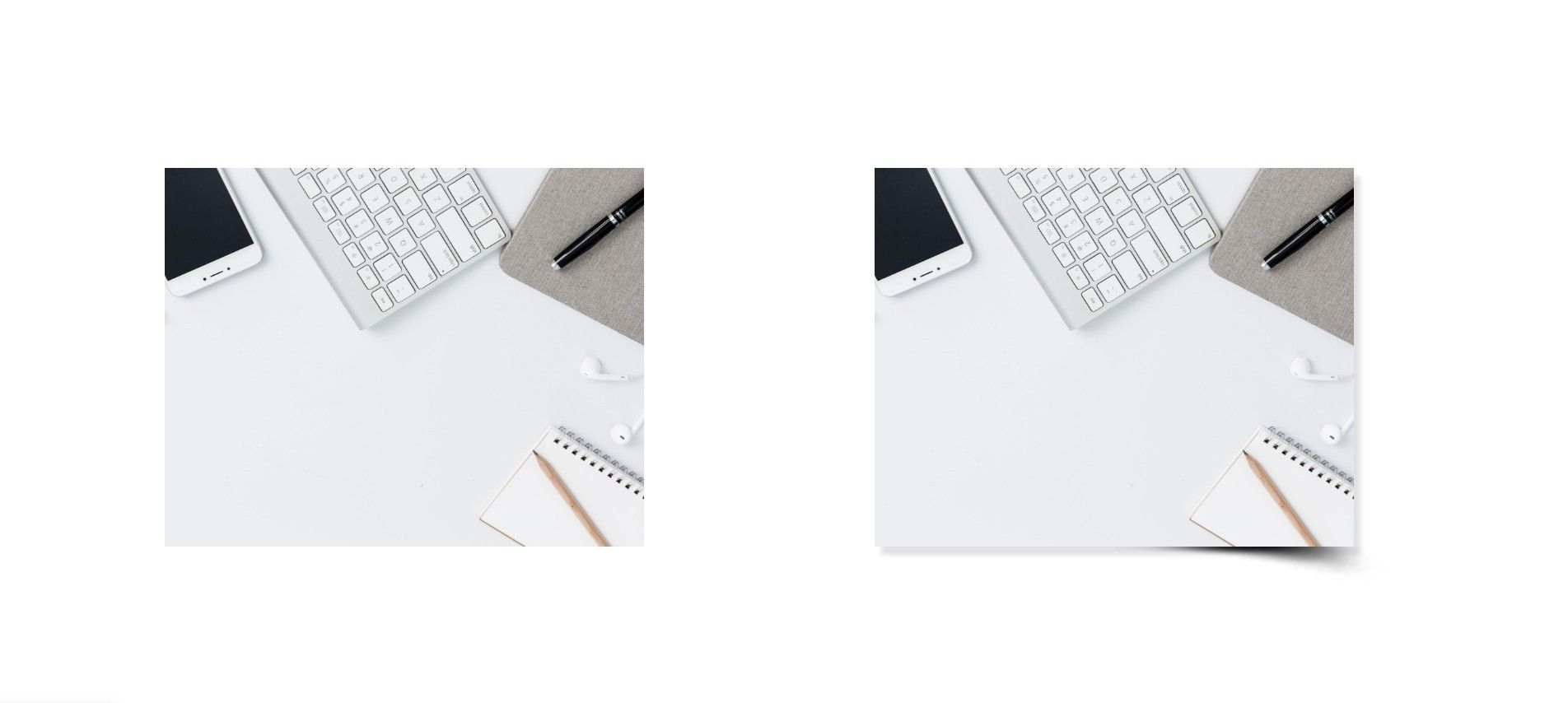
2. Use shadows to add depth.
Having a webiste that's entirely flat can sometimes make it look under produced or cheap. Try adding some shadows to your text boxes and imags to add depth. Just be sure not to over do it and stay consistent with your light source.
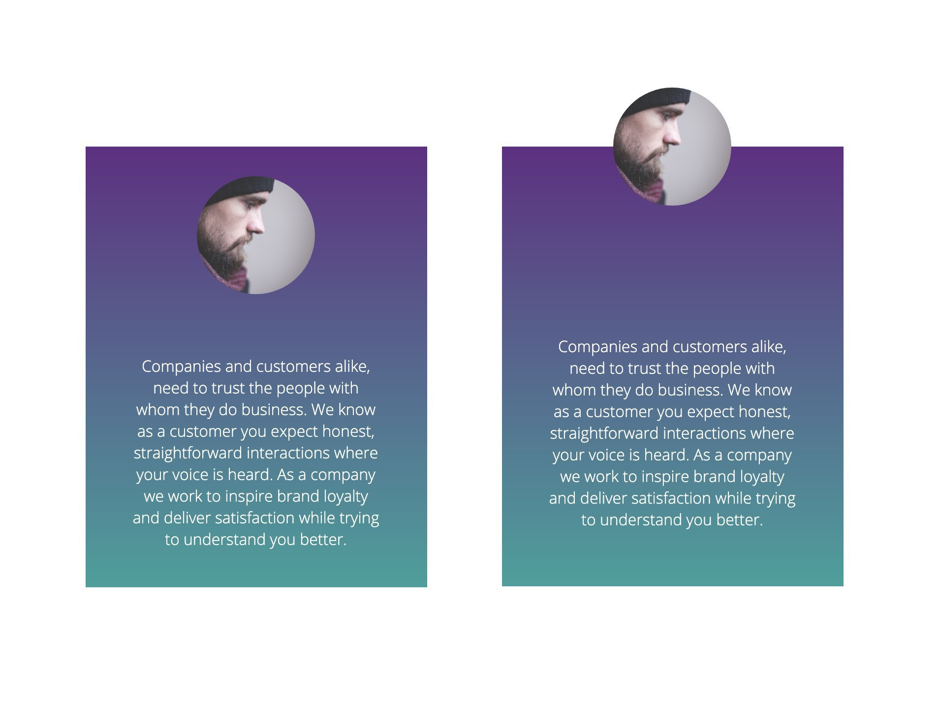
3. Overlap images to add depth.
Similar to adding shadows you can create depth by overlapping an image. Lets say for example you can overlap a text box with a round profile pic to create some depth and make your page pop.
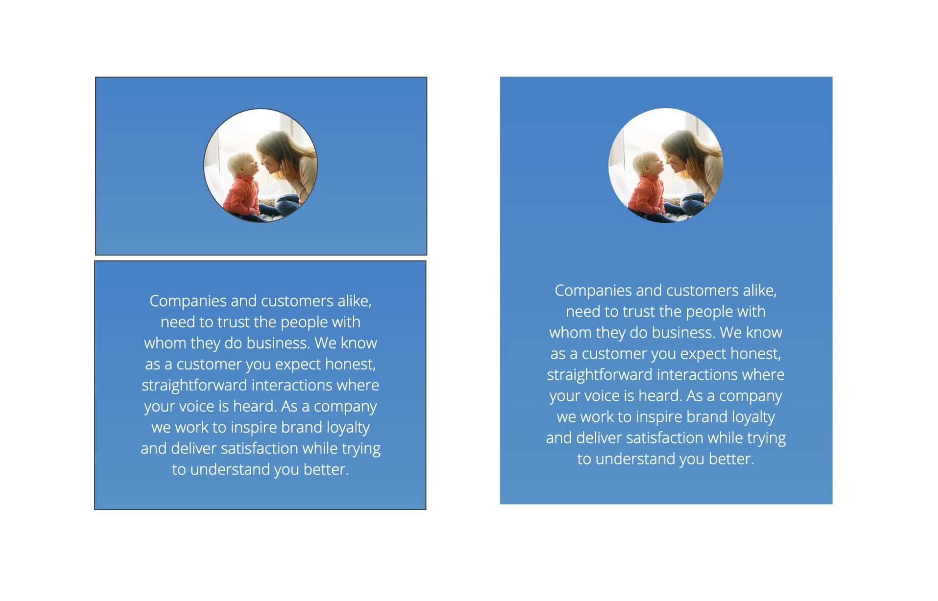
4. Use fewer borders.
Having borders around all the boxes on your website can make your pages look busy. Try using varying background colors to show separation as opposed to border to give a neat and clean feel.
5. Add spacing.
White space is a very underrated element in design. By adding spacing around images and text boxes you can make them easy to read and draw attention them as a focal point.
As always you can get started creating a free website at WebStarts.com