1. Establishing a goal
It's important before you begin designing your website to determine a goal. There may be several things you'd like your website to do for you or your business. But if you had to choose one thing it should accomplish what would that be? In all my years of experience designing websites I've found the purpose of one's website usually comes down to one of these three primary objectives.
- Sell a product
- Sell a service
- Convey information
If your goal is to sell a product or service you need to drill down and figure out how your website can best assist in that process. For example_ perhaps your website best serves as a place to generate phone calls, maybe to capture email addresses, or maybe it's just to re-enforce your market position.
If your goal is to convey information you should determine what information you want people to find on your site. Is it latest news stories about your organization? Is it a schedule of events? Perhaps it's just a place to show off your accomplishments.
2. Visual Hierarchy
Now that you've established a goal it's time to start thinking about visual hierarchy. Think of visual hierarchy as clues and cues to what your website is about. Creating an effective visual hierarchy means taking the most important statements and images and making them the most obvious thing on the page, while taking some of the lesser important information and subduing it.
Knowing the average person will spend less than four seconds to determine if they're on the right page or not, I like to put a large, easy to understand statement somewhere near the top of my homepage. I call this the headline. Think about every newspaper you've ever seen, they all have a big headline across the top. That eye catching headline should draw your site visitor in, encouraging them to read more.
The same applies to images. You need to make sure if you're displaying images on your page they're relevant to whatever the your website is about. If you're selling cars for example you should show photos of cars as opposed to fresh produce. Imagine you go to a website you think is all about selling cars and see an image of a fresh produce stand. That wouldn't make much sense. So choose images that reflect the subject of your website and you're bound to keep people engaged with your page.
Many times things live navigation, testimonials, and endorsements can be good tools to help sell our products and services online. However these things can be secondary in nature and so the text you use to display this information can be less "in your face". Try using lighter colored or smaller text to display less important information.
3. Limit choices
Too often we're tempted to put every available product or tidbit of information onto our website. This is simply not necessary and can actually detour people from your website. When people are faced with a multitude of possible routes they become less likely to choose a route at all. Avoid tripping up your users by providing one call to action.
The call to action should essentially convey to the site visitor what they should do next. The call to action should typically be surrounded by white space, and be one of the most obvious elements on the page. I like to use bright, colorful buttons, that look clickable for my call to action.
4. Keep symmetrical
Symmetry is the quality of exactly similar parts facing each other or around an axis. Having symmetry on your website is what will keep it looking professional. A lack of symmetry is probably the one dead giveaway for any site created by a novice.
Think of it as the balance to your page. Pages with symmetry have a congruent look and feel. Create it by mirroring site elements. Whenever adding an element to a page consider where you'll place a counter balancing element in order to achieve symmetry.
5. Quality images
Every image you add to your page will decrease the speed which your page loads. But to create a great looking website you'll need some high resolution images. Be careful when choosing images to optimize them before uploading. TinyPNG.com provides a great tool for making your images as high quality as possible while making the file size as small as possible.
If you don't have great images, it's no problem. There are many places online to get free quality stock images. Pexels.com, Pixabay.com, and others. In fact you can find a full directory of license free stock images at AllTheFreeStock.com.
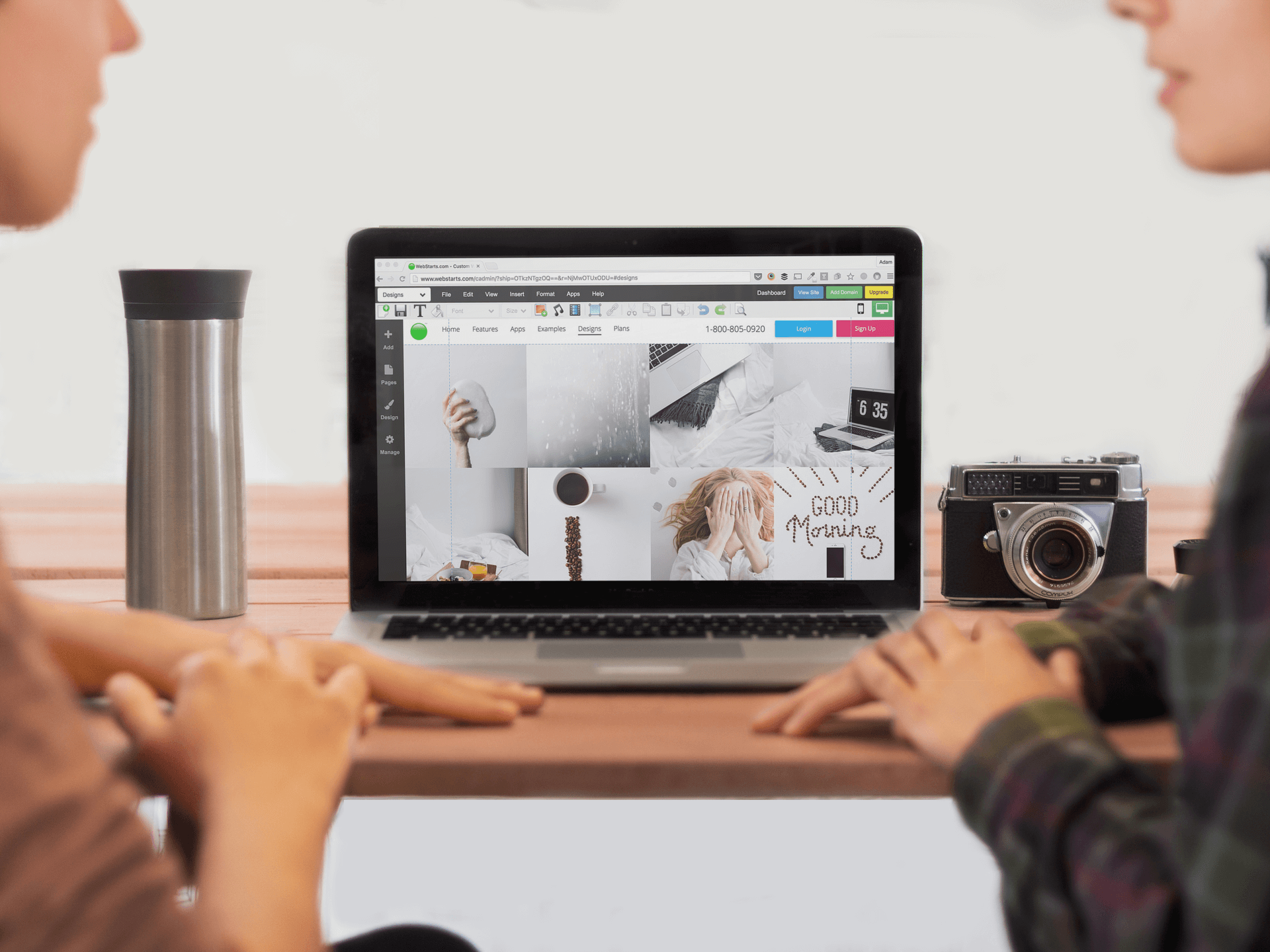
Now that you're familiar with these design principles go out and create a website. You can sign up to create a free website at WebStarts.com. It includes everything you need to get started. Your hosting, domain name, and design tools that will let you build a site without knowing any code.